Showing posts with label technical. Show all posts

Thursday, July 5, 2018

Why You Go Ahead and Publish

You've completed your novel! No mean feat! For first timers, it feels like it's in the bag, so you start looking for the lucky agent/publisher who has the opportunity of a lifetime to cash in on your bestseller.

High as a kite on aspiration, your fingers float over the keyboard. You type something to the effect of 'publishing' into that search bar.

Huh, editing... Well, I guess I did that. I ran spell checker after every chapter for sure! Professional? Yikes, how about self-editing? Ouch, steep curve... No wonder some people pay someone else.

Formatting... (And you thought editing was a curve...)

Beta readers? Can I trust my precious to just anyone? If I like it, someone else will, right? No guaranteed feedback. Should I get an NDA? 

Brain freeze! Wait, I'm drinking hot coffee...

Let's suppose you get past the intimidation of the basics. You formatted, edited, read it to the point where there's nothing left to nitpick. Still, something just never feels right. You find a misspelled word in the first chapter--ugh, it's ruined. You edit again-- ugh, you hate that dialogue, that character, why did you give that a pass? You dismantle, you rearrange, you rewrite.

Guess what? You're probably ready. For what, I can't say. If you don't have the confidence yet to put a value on it, you have to know that most authors,,even best selling ones, never love their work when they took the leap of faith and never looked at it since. They often need fans to even help them revive the memory of it.

Wait, shouldn't they know it like the back of their hand? Funny how accurate that saying is. Try drawing the back of your hand from memory. No peeking. Even when I tell you to draw it while looking, you'll probably look constantly as you do. Let's say you have a photographic memory or you truly memorized the back of your hand because you're kind of an asshole (don't worry; I've done it just to debunk an argument too). The recall of even a pristine memory is often very clinical, devoid of emotion in order to exact perfect recall of the visual. Something gives. Your mood, your confidence, your nerve, your dog ate your hard drive, what novel? The point is, your novel is not sentient. Although I would love to see you write a book to that effect, you're probably looking for an out that isn't really rational.

Name any famous author. Their work is shit. What about--? Yup, them too. Because any famous author is just not someone else's favorite. There is no universally beloved author. None that come close even have an entire don't of work that can do no wrong. They've cashed in on their fame, become hated on Twitter... Well, you would trade in fame for a small, loving fan base anyway. Ooo, you want a hugbox? Do you think trolls are less evil when they find you? Oh ho ho, no no no no...

I'm not here to frighten you away from this. To make fans and friends, the work has to get out there and that means trolls and assholes too. You'll get passive aggressives that insinuate how similar your work is to someone else (coughripoffcough) too. Oh, give you a troll over the crusty grey assholes any day. 

Just ask yourself if you're ever going to burn this manuscript or if you'll pine over the what-ifs. Ask yourself if you're truly a storyteller or just a rabid fanchild. 

Why do you publish? Because you know its value. Because you're ready. Because you have more stories to tell and this one is just the beginning of a pattern of completion you're setting. I can't give you that answer, but in this day and age, with all that's available to you?

Because you fucking can.

You can also pull it, learn from it, grow from it. This is for YOU to decide. Scary, wonderful, terrible, terrific, yours.

Friday, May 4, 2018

So You Want to Get Technical? Formatting 101


This is going to be pretty lengthy, but this was a tough one to figure out. I'm going to assume that you haven't even begun your book yet and get you to the finish line.


One of the reason I'm doing this is because I managed to bungle this so badly that I actually broke my first few manuscripts when I thought different word processors would play well together. Sure, save it here and here and here and somehow confuse Word so badly that it thinks I'm using multilingual fonts, randomly panics on punctuation and changes fonts and can't be cleared of this formatting nightmare. (This wasn't true, but if you do manage to break it similarly, I'll be happy to share how to fix this-- this post is going to cover how to do it right the first time).

First off, definitely use templates if you're deviating from the normal font settings for whatever reason. I'd advise leaving the default font alone and not even bother using it. If I'm losing you with the vocabulary already, don't worry-- I'm going to get simpler as I walk you through it. Don't worry; I'll use screenshots and get you there.

For one, if you're going to self-publish in print at all, start there. Formatting to digital is a cinch, but keep in mind, digital users get to alter the font to a uniform one so you'll lose all of your fancy choices there. I'd advise that if you do want to offer those in the print version, at least remember to put double spaces between those so that they are at least separated for effect for the digital.

I'm going to assume you do know how to open a new document and save. Right away, you need to name and save your new document. You can set up autosaving in preferences, but I prefer to manually save every few minutes on my own, something I have built in out of habit. After each of these steps and any new addition, SAVE, SAVE, SAVE. You don't want to be stuck wondering what you've lost if it crashes for any reason.

Let's get going.

Template:
KDP and CreateSpace both offer templates for your book. Figure out what size you want (I use 5x8 or 6x9). Follow the instructions to load them into Word. You will need to do more than this later, but the template will start you out until you are finished. The last step is easier done once you are finished and this is mainly because you may have multiple sections that can just be altered all together. Just get your template up for now...

Title Page:
Do yourself a favor and don't use an image, even if you took liberties with the title design on the cover. Keep it simple and use the style, but format it as text in your word processor. Why? Because in order to get this to line up for digital, you then have to use HTML coding to get it to size and align right, which I'm not going to cover either. I can tell you how if you went and got stubborn, but again, that could be its own post. For now, just do this.
 I'm going to walk you through the Home tab settings...
Go the Styles Pane here. You can be kind of flexible in creating your styles, but leave the default alone. Just trust me on that. I don't remember if it's called Normal or Body, but I don't use either. Always, always set your own even if you like the defaults. From the Styles Pane, click on the button that says New Style...

 I will show you and walk you through the only three windows you will ever need for basic formatting.

For one...
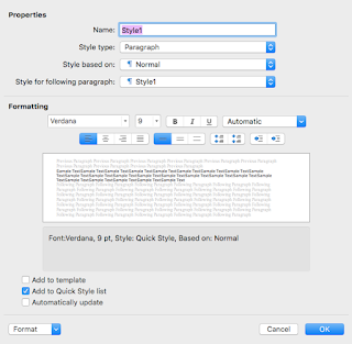
Before creating your Title font, go ahead and make your main body font. Name it something like Main Text, just remember what you use. I don't change the style type or even what the style is based on for the next two. Haven't need to use them ever. The style for the following paragraph? Use the name of the style you are making right now. That will tell it continue using it when you make a new paragraph. As for the other settings, under Formatting, choose the font and size, pick Justify Text from the first four box cluster. You can usually leave the rest alone.
 Do you see the drop-down menu in the bottom left that says Format? Drop that and pick Paragraph to get this next window. The first tab Index and Spacing in blue is where we'll start. If alignment doesn't say Justify, you can change that here too.
In Indentation, go to Special: choose First Line in the drop-down and pick .5". This will indent every paragraph for you.
In Spacing, again, just change Line Spacing's first dropdown to Multiple then type in 1.2. This is the industry standard. 
You're pretty much done with this, just click on the tab beside Indents and Spacing (Line and Page Breaks) for the next part.
This is pretty simple. I usually check Widow/Orphan control, keep lines together and don't hyphenate. You might not like how Keep Lines Together works, but don't skimp on Don't Hyphenate. You will end up with a mess of cut-off words that is a nightmare to read if you don't.
Once done, go ahead and click OK. You can always modify your new style later by highlighting it and clicking on Modify Style, which is beside the New Style button.


Now your Title Page font can be done in the same way, you might want to fiddle with size and font a bit before you find what you like. Once you have your Title Page the way you like it? Do this:

Next to Home is Insert. Go to the third option Page Break and hit that.


Dedication Page:
You can use your Main Text font or New Style/create another. I recommend naming it Author and using it both for the dedication and then again at the end to add a message to your readers. Personal preference there, but it unifies the usage of your personal message. For every separate page you want to add, MAKE SURE YOU INSERT> PAGE BREAK AFTER EACH ONE. This goes for every chapter, but I'll remind you again.

Before I take you through Table of Contents, go ahead and create your heading text. Name it something like Chapter Title.

Go through the process for your Main Text font, but pick these options:

 Properties> Style for Following Paragraph> Main Text (or whatever you named your main font)
Formatting> Center text (you may want to choose a slightly bigger font size and even put it in bold too)
 Indents and Spacing:
General- Just check to make sure Alignment says Center
You don't need indentation or spacing unless you want to. After typing your heading, tapping Return twice is sufficent, but you can set line spacing to double-spacing if you only ever fit headers into one line.
Eh, you probably won't need it, but go ahead and choose Widow/Orphan Control and Don't Hyphenate. This will manage the look of your headers if they're a little long winded.


If you also want a "Part 1, Part 2" whatever heading in your Table of Contents, make that style now. This will be assigned 1 in the hierarchy if you do, with your Chapters as a 2. I'm not going into that here, but I will explain the hierarchy deal with a screenshot since it will need to be set for your TOC regardless of whether you need more than one option or not.

Let's assume you only want Chapters to show up and you have that style now.

Table of Contents:

In the References tab, you'll find Table of Contents on the far left. When you click on that, it gives you this window. See Custom Table of Contents? That's the one you need.


 This is actually the part that people get hung up on, but I'll get you through it in one piece. You're going to leave most of the intro page alone and head straight down to the bottom left button, Modify...
 TOC1 stands in for your first font. Click on Modify here too. If you're doing a Part heading, make it look how you want that to look. You will then highlight TOC2 for the Chapter look.
If you are only doing Chapters, you will only need to modify TOC1 to look like it.
All this does is control what your headings look like in the table. Don't overthink this part. You can actually make this look completely different from the ones you use in the book itself.
Once you've clicked on OK for your Modify, click on Options in the main window instead. THIS is your hierarchy and for this, you need to find the actual style fonts you made and are using in your story and label them 1, 2, and so on. 
If you used Parts and Chapters, Part is 1 and Chapters is 2.
If you only use Chapters, find it and put 1 in the TOC level box. Click OK then OK again and we're done.
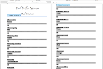


Now, by default, your chapters will fill in like this waste of space. Hate it. Luckily, there's a way to confine them into a single line and it's pretty simple. 
You probably notice that beside the ruler to the right are two facing arrows.
Do you also see the little white upward facing around at the beginning of the grey? Drag the bent arrow on the far right to the white one and it will disappear. Your TOC will then look like:

I had to highlight each chunk in separate sections and repeatedly drag the arrow, but it works and cleaned it up nicely.

Now, if you're doing this first, nothing will show up right away. If you're doing this last, your TOC will populate if you followed my instructions. You can choose to manually populate the TOC any time you add a new heading by updating the table.


Right click on the table and you will see Update Table in the list. Keep in mind that each time you update the entire table, you will have to do the arrow fix again. That won't happen if you're just updating the page numbers (something you might need to do if you change the font size of a style).

When you click on the page number of your chapter, it will warp you to that chapter so it may come in handy to keep updating.


It took me a LOT of trial and error to get this process to cooperate. Hopefully, it works for you right away. If you think you might have messed up or if I've left anything out, contact me so I can address it. If you help me catch something, I'll credit you in the updated blog post.

Margins:

Before you go too far, let's set this up.
 
 In the Layout tab, Margins is once more on the far left. At the very bottom once more is Custom Margins... Not the one with the star image but below that.

When you click on that, it takes you to:

Here.
For most books, a .5" all around keeps it simple, but if you write big novels exceeding 50K words, you might need a print allowance of .75 or .8 on the OUTSIDE option. Why outside not in? Because your first page needs to be on the right side, not the left. Your first page is on the right.

Notice also that you have to click mirror margin if your inside and outside are different. For ebook, .5" all around will work. I'll cover the final setting for print and ebook later though.

You'll notice Apply to: This Section. Generally, I go with Whole Document, but if you're doing the funky section breaks in your formatting, this might offset pages wrong. Just make sure you skim your sections.

Page Numbering:

This might be considered extra, but it's a pretty simple one. I'm going to assume you DIDN'T make this a pain in the ass by creating section breaks that will need to be altered for each section. You can go back and change numbering conventions for each section as needed. Maybe the Whole Document option will work, but always skim through and make sure this is working on your final manuscript.
In the Insert tab, you'll see Page Number off to the right of the strip this time.

 When you click on it, you get these options. Ignore that Add Page Numbers is a pop-up that is partially concealing the Page Number one that you need to click on.


 Clicking on Page Number takes you here. Set it to these (if you want centered numbers on the bottom). These are your options to choose from, but these are the setting I like. Once done, hit Format in the bottom left.


Again, this is yours to play with but the defaults are usually fine. Very self-explantory. I do want to point out for the section break users, that the Continue from Previous and Start at: options are  important. The Continue will pick up from the last number in the previous section. However, if you have a picture or don't want to count a page or two as the next in the sequence, you can use Start at: to make it continue from any number you like.


Content:

If you've done everything in order, you should be ready to go with your story. Start with your first Chapters entry, which should turn into Main Text when you hit Return/Enter. Another point of advice here is that if you have anything that needs to be italicized, create an Italic Main Text font. If for any reason you change the main font, this is a precaution against losing an italics. I don't trust Word's font + style additions deal, where you just click on a new setting without modifying the font. Whenever possible, unify all changes into their own font so you don't lose them on accident.

The only thing I want you to remember is that you should ALWAYS Page Break after a chapter, even if it creates a blank page. You will need those for the ebook format. Now you can take out blanks for the print, but it's a bit of a hassle, involving creating a section break and making sure the page numbering and mirroring stays fluid. My advice is to keep the blank pages unless you're really set on always starting the chapter on a right page or some other specific look. In my case, as long as the print flows, I'm not concerned about those choices. Again, I can help you if you want to, but this is a big area to cover and that's extra. 

Finishing:
Let's assume you're done writing and want to make sure your basic formatting is ready.

Did you:
Update your table of contents?
Insert all proper page breaks?
Use the right styles?

Once you've got the fine details done, I usually save the page set-up for the final step.

 For this, you'll need the top option bar of your computer. Go to File> Page Setup... in the pull down.
 It will take you here. Now in Paper Size, you won't have the Trade Paperback option. I made that for this purpose and you will too.
 The first options are what you will see, minus Trade Paperback yet. Go to Manage Custom Sizes... for now.
 You'll probably get untitled in purple, but you can double-click to rename it. But in 6 and 9 for your width and height and make everything else zeroes. You already set margins earlier. Keep in mind if you are doing 5x8, these settings still work without problems.


 OK back to this screen then take note of the Page Attributes drop down menu at the top.


Switch to Microsoft Word in that menu.

I think it always says apply to This Section in the default. Just make sure that gets switched to Whole Document then click OK.


At this point, you should be set to save for print.
 File> Save As... (and tell me you've been saving a LOT along the way) to get to the right menu.
 Make sure it's named something you can remember... In the file format drop-down menu...
You'll find Export Formats> PDF. That's what you need. It will change the blue Save button to Export. Just click on that to save.

You may get an error message about page numbers falling outside of a margin, but I'll never had this become an issue when publishing so you can ignore it. The Previewers on CreateSpace or KDP will catch this if it is a problem. If that is the case, go into Margins and just hike the bottom margin up .1 or .2" and that should solve it.


Your last check? Open your document in Adobe Acrobat and check for any blank pages or wrong facing pages. If you need to delete a page (sometimes formatting throws one in), there is a Tools option in AA's top bar that has a Delete Page option and you can then save the document in AA with the changes. How it looks on the AA pages is how it will look in print. If you followed my instructions, it should be sized right (the Page Setup is where that happened).

For Ebook:

Once you are sure your print PDF is in order, I would go ahead and do a Save As and name your regular docx file TITLENAME_Ebook so your ebook settings can be altered next.

Don't worry about changing your fonts because digital lets the reader choose these anyway. The only thing that needs to be done is to make sure all margins are .5". You will not need the Page Setup as you did for print. I hope you didn't use images because they are a pain unless you use fixed layout, which will also make your ebook useless for small digital screens. I opted not to learn this and just use ebooks for text only. You'll have to look elsewhere for that route and I will warn you, it's a pretty deep hole and there's a reason most people decide it's not worth it.

-----------

I may have missed a thing or two along the way, so if I did, let me know what I overlooked. I kept notes so I could try to be as thorough as possible but these things are also second nature to me now, so it's possible I overlooked something important. If something doesn't work for you, that's where I'll need to be more specific for others.

Phew, this was a long one, so I'm bowing out. I do hope this helps some of you self-starters beat the frustration of the process. Not everyone is as stubborn as I am.

Friday, April 20, 2018

Read Me

Old enough to remember when we used to write that on neatly folded notes in class, as if we'd actually mistake it for a gum wrapper or some other inconsequential piece of garbage? I'm not going to tell you it was the 'good old days' because I don't miss high school, but I will say that my best friend and I used to get a little MORE old-school and draw a carrier pigeon on the outside too.

But no, nostalgia isn't where this is headed.

How can we as authors get readers to take a chance on us? Do we lure them with humorous carrier pigeons or abbreviate our names because gendered names are too damning?

For authors, there are a myriad of frustrations that can be disillusioning when it comes to pitching our books. Things I've heard said (and in some cases, I've said personally):

1. What should include in my bio?
2. If I write about _____, will people read it?
3. How can I convince people I'm serious?
4. Does my gender/genre/voice matter?
5. If my story isn't 'good', does it invalidate me?

Personally, I'm neither of the party that sterilizes my stories into trendy bestsellers nor the party that writes only for passion. Like most things, I aim for balance. Am I a talented writer? I don't know. I've heard people remark that I am but in some ways, feedback is about as frequent as Jehovah's Witnesses and Mormons coming to my door (but feedback is actually welcome). I think some people fear I'll either be too wordy and intellectual or too 'girlie'. And ffs, what would be wrong with either in regular doses? It's disheartening that women can feel comfortable reading books in a male voice but there is also an entire subset of men and uncomfortable women who peg all females in the same wishy-washy light, like we're all pumping out vapid romances and words are hard. I've beat that horse before and won't flip it and cook the other side now.

I suppose you could call the sexual scenes that crop up in my books 'smut' but do you know what that means for an asexual to explore that? It is rarely just about the sex. I'm calculating the actions of my characters on a level that complements their roles in the story. Yes, it is detailed and even a bit gratuitous but what's the point of drawing you into the heads of my characters if I kick you out at their most vulnerable?

Ohhhh, I see it now. Again, it sounds too complex. Here's the thing-- as a writer, I do see it as my duty to simplify the complex. I don't have a strict set of rules. I'm not going to talk down to you, but I'm not going to assume you know all of the unique rules of my fantasy world. And I'm not one of those people who will spew out endless lengths of fantasy names. I tend to use unique names but not ones too complicated to follow. There are three main continents in my first series-- Vieres, Stoneweld, and Wheryf. There are a lot of characters for you to meet but they are written in compact pieces, more a collection of short stories. I sometimes jump to different points in their lives to justify an action in their present.

I realize my work won't be everyone's cup of tea, but it can be tough for me to sum it up when people want to know what 'my book' is about. It's never been 'a book' and people seem to forget that my memory is very spotty (irony). I can discuss the decisions I made if you read it but trying to sum it up or package it is a lost cause.

Let's be honest-- even among writers, there are many who see self-publishers as people too chicken shit to query and wait in line to be accepted or too greedy to hire 'professionals' to make a quality product. In case they missed the memo, I AM a professional. Not only a writer and an artist but across multiple media. I was a comic book artist first, spending countless hours combining story-telling and art. Artists are often polymaths. It waters down nothing.

Ah, I wish I could remember her name but one girl in a group I'm in wanted to learn how to get better at cover design. A frustrating number of 'Hire a pro' comments flooded the post. I'm not sure when disposable income became a thing, nor being so eager to dismiss people from learning new skills but her reaction was priceless. Something to the tune of: so because I'm a writer, I can have the confidence to write but have to outsource my vision of the cover? So if the shoe is on the other foot and I've made a beautiful picture, I should hire a writer because I can't be trusted to write the story I see with it?

Some artists are lucky enough to dodge this hypocrisy. If they manage to have an acceptable level of talent, humility and are safe/non-threatening enough anyway... There are a lot of insecurities in large writing communities and sometimes having a 'fall-back' plan is met with the accusation that you aren't serious enough to have a single discipline. I once remarked that I would love to have a Master's degree so I could fall back on teaching when I couldn't meet the demands of a full time artist and, despite the fact that I'm actually a passionate person that would make a great teacher, all my detractor could focus on was that teaching was not a fall-back plan and should be a first choice. I can't agree with that. Many people find their passions AFTER they follow the curiosity to try it. In fact, it's often the over-zealous that dive headfirst with enthusiasm and realize they're not cut out for it. None of us are under any obligation to stick with something we are not measuring up to. Why not try to be a teacher, a guru, a muse? My muse is certainly a temp sometimes and one that whines about vacations while beating me into submission.

Here's the thing. I can't convince you of anything, no matter what I tell you. Many of you have your own ideas of what I am and what I write and if I deserve a reward for my hard work or whether my misery is important for your 'I told you so' philosophy. Most of the people who reach out to me love what I do, love my sense of humor, think I'm sweet, etc.  It's certainly a matter of quality rather than quantity.  To answer the five questions above, I don't know what to put in my bio, I write fantasy that speaks to my psyche, I can't possibly prove I'm more serious, being a woman writing fantasy in a woman's voice is not going to enlighten you to my abilities, and no one can invalidate me if I didn't seek their approval to begin with.

You aren't wrong that any artist wants their work to be looked at and even loved, but the world can't come crashing down if it isn't. It's not as simple as being a livelihood and mostly it's not even a choice. I can't tell you how many days I woke up and begged my brain to give my hands and eyes a break but ended up working exhausted anyway. Creativity can be downright parasitic and just as deadly if we try to detach from it. There's a reason the suicidal artist is an eye-rolling generalization. It is so built into some of us that trying to suppress it makes us horrible to be around.

You may have also noticed that artists often have to bleed on the paper. It's in these vulnerable moments where people want to latch on. Bestsellers can be safe but if you want a story to stick, it has to get its claws in you and leave a trace in your blood.

The younger writers want you to fall in love with their characters. I have almost never even cared a little. I can't tell you how many times these characters are so generically laden with flaws and strengths designed to be likable or repellent. Real characters, raw characters, are not like that. I fall in love with the weathered characters, the ones that never wanted to be heroes or villains. Take out 'heroes and villains'. How about liberals and conservatives? Artists and coal miners? Introverts and extroverts? Where's the right or wrong in the opposites? Because of that, I don't beg you to like my characters. If I'm doing it right, they're your annoying best friend or your rival you secretly admire. I write stories that you let you feel any damn way you want and possibly ask yourself if that's how you really feel and none of that hurts the story. Did you sympathize with the sadistic psychopath? Does that makes you feel like a monster or merciful? Will you keep reading to learn more about yourself?

How's that for a pitch?

Thursday, April 19, 2018

Working with the Window Open...

I keep saying I'm going to take a break from drawing, like one 24 hour period without it, but coming up on the 6th day in a row just proves I'm a shameless liar. How can I stop though? I have one book cover done and another the other four in various stages of completion and already they are looking amazing.

And today? Cool air, sunlight, perfect weather for drawing so I couldn't pass it up. I worked on the clothes and shoes for one cover, started the outline on the next, and did most of a background for another (gasp, yes, background-- the one thing I will usually troll through stock photos to avoid doing). A great day and now I'm get ready to force myself to stop and give my hands and eyes a rest. Will I take a break tomorrow? Probably not. I'm already mentally plotting what I want to draw next.

Although, I should probably stop calling it drawing. Drawing gives off the wrong impression. It's digital painting. No one take four hours just drawing shoes. Also I paint on multiple layers. I shade skin that will get hidden by clothes on the finished product. I'm scribbling guidelines and palettes that will be hidden later too. Digital painting is not really like drawing or traditional painting at all and the stunning visuals and effects sometimes need special brushes (some I have to customize using a source photo or a vector image I've drawn).

How about a visual? This is my layer window and I haven't even done more than outlines and skin layers for the characters yet (and the character folders are closed or I would have need a fourth screen shot).


And yeah, I can't condense any of it. Each layer represents both a separate visual element and the order it needs to be to be visible. The background alone is occupying two and a half of the screenshots. Of course they're all in a folder that I can close to navigate easier once I'm done manipulating it. You can absolutely paint without labeling and organizing. It's also a pain in the ass to find everything if you do. I was a little lazy here, but I can remember what some of the default numbered layers are just by the labels around them.

I probably mentioned it before but I've been taking screenshots of my progress with all of them to share later so I can take people through my process. It won't be as detailed as a tutorial, mostly shots involving wherever I stopped or certain milestones. Mostly I've nailed some of the details by studying photographs and color-picking areas to attempt to recreate. What makes it challenging is that I'm NOT aiming for realism. I'm attempting to inject my style into even reference photos. I'm using 3D and physical models to figure out poses. It's an amalgamation of many sources, but still what I originally envisioned.

I'll cut out so I can get some rest though. Plenty of fun for the next week or two where the digital painting is concerned. I'm hoping to jump back into writing once I get through that. I've certainly been playing with UnSung enough in my head that I will beat my muse if she hides behind a blinking cursor. Hell, I've even been playing with ideas for UnHeard and that's not even a bridge I've come to yet. All this practice can only help the web comic though. I'm creaky and achy but it's the work I love.


Tuesday, April 17, 2018

Tools of the Trade - Personal Preferences

I've been wanting to cover this for a while, but this is something that will really help the visual artists among my readers (or maybe those curious to start trying to draw their characters).

This also goes for people who wonder what my favorite tools are. This won't be super-comprehensive since I don't work in every media both traditional and digital.

To start, yes, you can draw with anything. "All I need is something that makes a mark and something to make a mark on." Sure. There are professional artist that can work magic with ballpoint pens or Sharpies on regular printer paper. These mediums are what they want for their style and results, but if you're not happy with the results, if you want things more aligned to developing your own unique style, this is why those more expensive options exist. It's not just for bragging rights and it's not just frivolous brand recognition. I can say this for certain.

Let's start with traditional tools.

Pencils- This is one place where I'm mostly okay with using any brand of mechanical pencil with a variety of lead thicknesses. I rarely do pencil-only work and I learned to do pencil shading with my fingers. If you're afraid the oils on your fingers may leave prints, invest in tortillons (which I will bring up again). I have a nifty tin full of Faber-Castell drawing pencils that does get light use and I highly recommend them. They sharpen well, no splitting wood or broken lead, and the lead doesn't leave fairy dust. These are the top of their line for a reason and if pencils are your passion, you'll have a set of these.

Pens- Phew, this is a big one. I went on a wild goose chase for the perfect archival ink pens. These specifically because they don't wick and they dry instantly (if you've ever use regular ball point pens, you know they tend to blob and smear and leave evidence where your hand rests on the paper). I have a lot of favorites here. Pigma Sensei (both Micron and Sakura) were my first and these are consistently great. The thinnest tip is like drawing with the tip of an eyelash and perfect for fine work. The thickest isn't just a marker, leaving those trails where you can see where you scribbled. They go on solid like paint. Generic archival ink pens are not lower quality ink, but the tips will not hold up if you go the cheaper route. Copic is the leader of the pen/marker set. A lot of artists choose to shell out the big bucks for the replaceable nibs but for my pen work, I stick to the cheaper one-use pens and they last. Go with Pigma or Copic here. Sharpies aren't bad but they will wick bad on certain kinds of paper.

Charcoals, pastels, markers, colored pencil, paints? Sorry, I'm no expert here. I've used them on occasion but not with any frequency that I can vouch for the best. The industry leaders are usually your best best-- Copic, Staedtler, Faber-Castell, Prismacolor, Windsor & Newton. Today, there is no shortage of user reviews to help you find the right tools for your projects.

Paper- this is tougher than you think. I use many different weights-- some for traditional, some for print quality with my printer. There are a ton of thicknesses, toothiness, and brightness factors to consider. It will determine the quality of line, what tools work best (wet and dry has very different tooth requirements), how it scans. There is a reason why there are so many kinds of paper grades. Some are just decorative, texture that is visually pleasing but impractical for handwriting or drawing. Craft papers have a bit of a learning curve. For a beginner, just consider your medium. For wet medium (like pens, watercolor, etc.) get a watercolor sketchbook. For dry medium (pencil, charcoal, chalk), go for a standard drawing paper. I find that comics are a whole other breed of medium though. I prefer smooth medium since I do pencil work first then use a wet medium like ink. Thick smooth paper is optimal for most of my work but I do keep thin, toothy paper for quick sketches or textured doodles.

Tortillons/blenders- I told you I'd revisit! These are dry blenders. I wanted to note separately that there is more than one kind. I have one that is rolled paper that peels away for a clean tip, but one is just compressed pulp. The rolled paper is looser and silkier for light blending. If I want to get down and dirty, the compressed paper is the way to go. Not many people realized this, but the white colored pencil is actually considered a blender rather than just the odd-one-out until you feel like using it on dark paper. For wet medium, there are colorless blender pens available, although watercolor pencils can benefit from water and a brush or a wet tissue. Fine tips are self-explanatory but you can also get brush and chisel tip blenders for variety.

Now for digital...

This one is pretty diverse too and you can make this work on any budget, I assure you, but you will get a more efficient workload and more fine-tuned results if you can shell out the cash.

Mac, PC, not a big issue. Mac does tend to have the edge on quality of digital program options. Macs are essentially geared to be design workhorses. Again, you can absolutely make either one work. I like to utilize both Windows and Mac OS, but I haven't bothered with Linux. I'm always told about how personalized you can go with Linux, but not all of us can prioritize the learning curve it takes to access those benefits. As a designer, you will always develop a more personalized sense of what you need to be versatile. If you're just starting, don't sweat it. You can find a ton of options for any platform. Use what you've got or invest in your optimal needs.

Tablets- Wacom, all the way. They have super cheap options like Bamboo. I currently use their middle grade Intuos 4 and I would love to shell out for a Cintiq or a Mobile Studio Pro, but the price jumps are solid benchmarks. A Bamboo can run you $30, Intuos cost me $400, the Cintiq starts at about $1800, and the MSP? $3000. Something to work for...

Programs- Tough one. If you can shell out for it, grab an older version of Photoshop. I have CS6, one of the last suites before they started the asinine subscription crap with CC. I consistently use PhotoShop, Illustrator and InDesign, but I do work with Flash and DreamWeaver on rare occasion. They have some great software for video editing, but I don't use all of the programs. Still handy if you're curious. Need a cheaper option? Go with Clip Studio Paint. I'm personally in love with the blenders on it. They beat PhotoShop hands down although I tend to love PS's custom brush capabilities more. PS and CSP are my interchangeable favorites, but I do get Illustrator involved when I need some vector work. I hear good things about free programs like Gimp or Inkscape, but I would still advise the precision and option power of the paid programs if you're a heavy duty designer/artist. Using the free programs does prepare you though, since the terminology is pretty consistent across programs. You can do great work with any program, but you can really up your efficiency and workflow with the better programs. You do get what you pay for.

I'm always available if you want to contact me and discuss the pros and con more specifically. One of the reasons why I keep a blog and a social media presence is to pay it forward. I've never been interested in collecting likes or seeking approval in that sense, but helping other people achieve their ambitions is still near and dear to me.

I hope this helps some of my writer friends branch into a new hobby or just improve on drawing if they already are. Don't be afraid to get curious! There's a whole other way to pull your muse if you need one. Get it going!

Monday, April 2, 2018

Interest Piece: The Basics of Crochet

While my blog usually combines personal anecdotes with writing tips, I do like to mix things up and enhance my abilities with the occasional writing challenge. I am not exactly a master crocheter, at least not in terms of fame, pure dedication, YouTube, etc. but I am adept enough to follow any skill level of pattern and even make my own. I'd love to do a video tutorial on how to do a dragon neck warmer pattern someday, but I won't jump too far ahead right now.

First off, I'm going to assume you know nothing about crochet to start. As far as supplies goes, it's more complex than you might think. Yarn comes in many different blends, types, lengths, weights and varieties. Blends can include acrylic, animal hair/fur, bamboo, silk, cotton, even paper. Aside from your yarn selection, you can also choose to use finer threads for more delicate work. Thin threads are much more durable that thin yarns. As far as lengths go, you can buy them in tiny bonbons or giant cakes and you'll run into different winding methods as well like hanks, balls, skeins, cones, etc. These all give you an indication of how you will need to work with them to unwind them. Skeins are the most popular since most let you neatly pull the center thread, keeping it compact while you work with it. A yarn's weight is actually another name for its thickness. A 1 is the thinnest, while 7 or even 8 is nearly a rope. The standard weight in most projects usually falls between 3-4, with 5-6 being bulky or super bulky. I won't bother with the exact names here because this isn't universal (much like the US is the only country that even calls it yarn, since most countries favor calling all yarn 'wool' whether it has any wool in the blend or not). With regard to variety, you'll run into some funky types like boucle, balloon, tufted, eyelash and so on. These are designer types and generally pretty difficult for beginners to work with.

A little history before I lead into the next basic and that is that 'crochet' is a French term meaning 'to hook'. The 'hooks' were originally very organic-- the first crocheters used bent fingers to make the knots that make up the craft. Nowadays, we have quite the selection, ranging from wood, plastic, bamboo, polymer clay, aluminum and steel. As with many aspects of crochet, there are differences between US/UK standards in size. UK uses the diameter in millimeters where the US system often uses a letter and/or number rating (I think it runs from A to S. There might be a bigger gauge than S but I personally haven't worked with anything bigger than P). My personal collection uses both systems since I've bought them from many countries. It's important to note that delicate projects often use a different hook type, typically known as thread or steel hooks. These are thinner and have a different numbering system. If you don't have your hooks sorted, you may grab a crochet hook that says 3.0, which is bigger than the 3.0 of your steel hook set.

I'll go ahead and insert an optional section here concerning gauge. If you're a beginner, this might sound like gibberish, but the takeaway here is that you might not need it at all. Gauge is something you typically only need when making clothing. Most patterns meant to be made to a certain size will include a gauge chart which will let you know how many stitches should cover a certain length (usually per 3-4 inches). This will mean starting a swatch to make sure your yarn and tension (the term used for how tight or loose your stitches are) will fit the gauge or if you'll have to use less or more stitches to get the size you want. Once more, this is something more intermediate or advanced. To avoid running into sizing issues, stick to the recommended yarns. Most patterns have them. If you're going to stick to potholders or dolls or doilies, it's not something you often need. It's worth noting that a lot of novices make the mistake of ignoring it when making cardigans or shirts and end up with something way too big or small. You can get away without gauging hats in most cases, but keep this in mind if you're feeling brave enough to get out of basics.

The basics of usage are not something you'll want to try to figure out through words or even pictures. Scour through some videos on holds (what is the most comfortable way for you to hold the hook) and tension (how you thread the yarn through your fingers while working). This is a personal choice part of the craft and one thing a good teacher will explain before teaching a single stitch. From there, you will want to learn the slipknot. Again, no one way to do this. I personally like doing the pretzel method. You will do it at the start of every project without fail. Your next move will be chains and single crochets. For years, I never did more than single crochet and there are many projects that can be made from that alone.

I have to add here that I am once again using US terms. UK calls chains the single crochet and the single is a double for them. The rationale with the US system is that the chain is not a complete stitch where the single is the simplest secured stitch. The UK system's rationale is how many times you hook the yarn onto the hook (chains use one, the next uses two, etc.). I wouldn't worry too much about the why each time, just pay note of whether you're using a US/UK pattern. I learned US first so I think down single is a chain, double is single, triple is double. I've never done more than a triple treble which basically just looks like a chain. The basic stitches are single, double, half-double, treble, double treble, triple treble. Once you start looking for more difficult techniques, you'll run into types like crocodile, moss, butterfly, spike, puff, etc. that often resemble what they sound like. Many of them skip traditional looping steps you learn in basics or are simply a combination of basic steps (a standard crocodile is just a chain, three doubles, a chain, three doubles and a chain-- the effect resembles a reptile's scale. Be warned that you have to set up a lattice row of V-stitches to arrange them on. Please note this was the first stitch I learned outside of basics so it's not quite as confusing as it sounds-- it's just some new terms you pick up).

Beyond this point, you're branching out of basics. I was very experimental rather than procedural when it came to learning stitches, not minding the skill level. I ran into a lot of terms that meant nothing to me, but if you're learning via the internet, you can search terms very easily. Just by way of example, I've learned terms like third-loop crochet. Once you know the anatomy of your stitches, you'll get curious about what happens when you work around or behind a stitch and yes, they give vastly different visual results. The third-loop actually gives a very knit-like stitch that I love using on hats. Back and front post stitches are entirely used on the waffle stitch, a great stitch for thick warm hats and blankets. Cable stitching was once a knit-only technique but you can emulate the look by alternating long cross/X stitches in each rows. I've done basketweave and chevron stitches that use the same concept. The point here is to rouse some curiosity in your creative possibilities-- there are tons of stitches in crochet design! If you want to see some truly amazing freeform work, Russian crocheters are amazing at this.

As for patterns, you'll want to learn the acronyms/abbreviations and possibly charting. Russian patterns are notorious for using visual symbols rather than word directions. I find this more generous since it creates a universal language for sharing, but they are difficult to use for many crocheters since you have to think right to left then left to right for flipping rows. Make charting your intermediate curiosity since most patterns are written out. If ch, sc, hdc, dc, tc, dtc, ttc aren't second nature, that's okay. Almost every pattern regardless of skill level will have a key that explains ch = chain and so on. The key may be introducing new stitches and may or may not be included in the instructions. The hardest patterns will expect you to already know how to do most stitches and will only include stitch instructions if they aren't commonly used or if they themselves have invented the technique. If a pattern is lacking a skill level ranking or some details, you can often find comments where you downloaded it that will clarify or the pattern maker will have contact information otherwise. Be polite but don't worry about 'bothering' them. If they overlooked something, you are doing them a favor by spotting something they can update their pattern with that will help someone else. It will help them make more thorough patterns and better quality means better paid patterns.

As with all creative efforts, enjoy free patterns, but don't expect them. The most unique projects will often require you to pay and please, please, do not download pirated patterns to save a buck. Crochet designers will not stick to making innovative patterns if they can't afford to spend the time doing it. Not all of them are well-cared-for hoursewives or sitting on a cushy retirement incomes. Many are single women and men with other jobs because it's hard for a lucrative career to be had in creative jobs. People will haggle, undervalue you, expect you to treat it like a hobby or a passion and tell you that expecting to be paid is greedy or deceptive. I can't stress enough that people who do it as a 'hobby' are also often wealthy through marriage or lack of financial responsibilities and can afford to not take it seriously (just like the people you can't stand at your job who coast by doing little to nothing, they just don't value it the same way. Not less or more, exactly, but it's different). People who do things as a hobby also tend to feel they are novices. Here's another big one- they also tend to be doing it solely for themselves. They are making what they want, when they want, with little concern for the audience. 

Custom orders can be fun but they come with the added challenge of unknown supply costs and availability and unpredictable labor times. It also means they aren't making new innovative ideas and might be bored with making it for the 50th time. Yes, when making gifts, you often consider who you are making it for. But just like you selectively decide who takes priority on holidays, a friend of a friend is hardly someone who gets free or even discounted handmade gifts, let alone everyone else who wants to complain that you sold a $30 for $10 to a family member. Trying to haggle with a crafter's price is often how you'll end up being politely told to find someone else. A crafter is not a wholesaler. We have to evaluate what cost will make it worth the time and effort. It's not a matter of missing out on money. A skilled crafter has way more to consider than a lost sale. How many people would show up at their job if they were told you need to work for the next three weeks nonstop but they could only pay you the $50 it cost you in gas to get there? Yet that's exactly what some people's logic is towards artists. Yes, supplies ARE expensive (like gas) but if you're going to monopolize someone's time, there's no mutual satisfaction unless they are paid adequately for their time. When you contract someone for a freelance job, expect to pay at least minimum wage. Freelancers often have to charge you a 30% mark-up for taxes (because that is what the government forces freelancers to pay if you make more than $3000 in a year), supply costs, and if freelancing is their only job, they have to somehow manage upkeep expenses, insurance, as well. Wonder why freelancers are so 'greedy'? Well, because they have to make a living wage. You want convenience and quality, you get what you pay for. Go after corporate greed all you want, but don't take high prices out on freelancers.

In any case, there are your basics. Supplies/tools, things to learn, considerations for what you will do with the skill. I absolutely loathed turning crochet into a business and it didn't last. It's not something I ever want to do again. I can take the abuse when it comes to drawing and writing because it is what it is and I don't mind being accused of being selfish. I am and I'm not-- I might write what I want to read, but I also consider making it interesting for more than myself. Crochet is something I somehow take more personally so I don't take criticism on its worth as easily. I know what time I put into it and if I let any of it go, I don't bargain with it. I want to be sure that whoever I give it to will treat it well and treasure it. You can't mass produce crochet as you can with knitting. Every stitch has to be done by hand. I spent countless years learning it and it's the closest thing to mastering anything as I have come. Most of my creative pursuits make you aware that mastery isn't really possible. You can be really good at something, successful and considered an expert and still have things to learn. With crochet, there is absolutely nothing I have not been able to learn almost instantly. I have absolute confidence in it. All the more reason I don't tolerate underselling it. I will adjust any other skill I have to market it better because it's subjective. Crochet is a one-off piece and you like it or you don't, so you'll pay what it's worth or not at all. 

I could keep rambling. That's only the tip of the iceberg but my only general rant. I'd like to continue writing about the more technical aspects of crochet, but I may use a separate forum than my writing blog for that. There are many apps and sites that look for experts in special areas that might serve better. Blogs are hard to develop traffic for too. Much better to go to a site like Quora or Medium.

If you're here for the writer's blog, keep writing! For the crochet part, I'll update on this later.

Monday, March 19, 2018

This, Too, Shall Pass!


And who can argue with Gandalf?

I know, I know, that's not what he says. Welcome to my head. When I use this little four word pep talk, I absolutely see this epic scene where Gandalf goes toe to toe with the Balrog play out in my head.

It's certainly effective when the nasty fingers of doubt, the darkest parts of my soul, the things I'll swear with bravado are behind me because 'I'm stronger now.'

I'd love to say that is why I'm drawn to writing fantasy, that it's simple escapism. It's true enough that it's therapy in disguise, but it's not just there when I'm sucked into the darkness. In fact, nothing is in the darkness and fantasy is not always sitting there with its hand out, telling you it will all be okay.

You'll find that writing groups and author circles are often full of people that will remind you that this state of being is unexceptional. More often than not, the thick of it is also paralyzing and you'll see people panicking as to what they can do so that it doesn't slip away.

More often than not, I won't talk about those dark times and I won't reach out to anyone either. It's usually a good sign that I'm coping if I do. Often it's the silliest thing that tilts me out of those stupid pits of hell; the motivational Gandalfs or the British voice of reason (because oddly enough, a good dry insult is comedy gold for me).

This post isn't really going to go deeper. There are plenty of posts that will dive into the personal aspects of rock bottom, but since I'm writing about it, I'm just not actually there. It's like the absurdly wealthy trying to convince you they remember what it's like to be poor. Our brains are actually trained to ditch that shit as soon as possible. Even if we remember it quite clearly, survival instincts file it under 'let's not go there again.'

Last week, I was actually functioning while in a bad physical and mental state. I managed to do some coherent editing and meet my goals. It's probably because of that stubborn insistence that I'm not still in that state of mind. Do I want to talk about it? Not really because it doesn't have a catalyst, some current tragedy to explain it. It just happens. Well, aren't I ineffective when in that state? Eh, probably, sort of, but let me tell you, if you can still manage to pay attention to what you're editing in that state, it's probably pretty amazing stuff. It definitely means that some things have to be looked at again when I'm less foggy, but here's the thing-- it's actually kind of valuable. While ideally, I like to edit when I'm neutral about my work and when I love it, there's a gold mine in when you're sure you're going to hate your work. You're becoming your own objective audience-- you've got your superfan, your passerby, and your troll all right there.

I'm not really hiding anything; I'm just manipulating my own feelings into something usable. Armed with Gandalf, a sense of humor and a story, I'm ready to trample my trolls.

In case my people are wondering, I tackled an impromptu screenplay edit and finished editing the first part of UnSung. Tomorrow, I'm going to read an origin story first before tackling either proceeding with UnSung or doing some cover art. Either way, I'm armed with some pretty solid weapons in the fight ahead.

Do what you gotta do and keep writing.