Showing posts with label self-publishing. Show all posts

Friday, July 20, 2018

Where to Self-Publish

Despite my intent to slow down my blog posting frequency, I did decide to pop back on after a long day of more formatting hell when I realized I've never really gone into the wheres and hows of self-publishing. First off, if you haven't read my post on Formatting you'll need to go through it and make sure that's squared away. Uploading is not a quick process and you'll quickly run into hitches in the review and vetting process if you're not tight as a whistle here. 

If your formatting is absolutely wretched due to Word's butchering of copy-pasted material, one quick way to fix this is to drop everything you want cleaned up into TextEdit, Notepad, one of those default text programs that came with your computer. It will strip all of the funky formatting garbage Word is confused about. You can then safely copy-paste it into Word or your program of choice and not worry about the mess it makes of text that just will not adhere to your manual changes.

Without further ado, I'm going to make this as simple and free as possible. One of the reasons for this is because, if you're as determined as I am to do everything yourself, then you're already dumping massive amounts of time and energy and I just want to give you the least complicated, least costly, stellar services possible.

CREATESPACE/KDP:

I used to use CreateSpace. At one point, it had the better options for print. KDP Print now tops that, offering both expanded distribution and a ton of industry standard size options. You DO NOT need to commit to Amazon with KDP Select and unless you're already banking on your name, I'd even suggest you don't. I'll come to why later. First and foremost, you'll at least want to take advantage of printing through KDP Print. I love, love, love the smallest print size, but between the 5x8 and 6x9, there is no printing cost difference between them. Most people I've surveyed like the smaller sizes for paperbacks. The best part is that if you do want to go ahead and get the book right to Kindle, it can easily take your print files and convert them for you. They offer templates (but please use the exact measurements unless your page count is EXACTLY on the mark, 300, 310, and so on. Yes, the reviewer does reject your PDF if you're a tiny bit off. I've left feedback requesting an autostretch option to save us time on the minute difference). You will need two separate PDFs for the book file and the cover, but it's pretty simple to find and follow the requirements. When I started out, reviews could take as long as 72 hours, but since I've been around a while, I rarely wait longer than 6-12 hours to get the approval. So start with KDP Print for your print paperback option. Author copies are only the printing cost and shipping so it's a great way to load up for conventions or signings.

SMASHWORDS:

Before I found this one, I used Pronoun, but they had to close suddenly. I was floored that I might have to distribute to each retailer I wanted individually. Not so. Smashwords is a terrific place to get the widest distribution options on digital. Kobo, Apple, Google Play, Nook and a lot of prestigious services that handle international distribution. Very simple to use-- you'll need an ebook cover file and a regular .doc (not .docx) file. If you are up to par and your review clears, you'll make it to their Premium status which automatically sends your work everywhere possible (if you don't, then your book is limited to their site, so it's worth it to clean it up). Charge what you want or let your fans choose, and you can even make it free. The Dashboard is easy to use when you need to check the status or issues that come up. The Publish link is where you start. Very clean interface and you won't have issues navigating it. Smashwords can be a little slow, sometimes taking a week before being cleared for Premium, but it's another site that does all the conversion and distribution for you. One other thing, after submitting, hop over to the ISBN manager and set that up. If you don't it, will remind you, but I like to beat the reminder.

--------

Hardcover options aren't going to be free but IngramSpark/Lightning Source are pretty cheap. I think the baseline is $35. I don't currently offer a hardcover option so I can't vouch for it, but the consensus seems to be for it. I know you see some pretty fancy print options coming out of publishers, but it's also through their topsellers. Self-pub is a great way to get your work out there and you're perfectly able to shop for trad-pub options if you'd rather leave those details to someone else. Self-pubbing is a lot of work, a lot of creative decisions, and... a lot of marketing. Even though I don't do much of that yet. I know, I know-- I should get on that. I will. For now, I'm just happy to be writing my stories.

I don't mind helping out new authors in the troubleshooting process with SW and KDP. I'm pretty sure I've been through it all by now and I'm happy to share.

Phew, this day went quick, but it's cleansing to pack it up on this note. Don't hesitate to ask though-- I see it as a good opportunity to add it to previous teaching posts and do what I can to build a solid database of helpful posts.

Friday, June 15, 2018

Where Does the Week Go?

It's easy for an entire week (or more) to pass in a blur. It's not that I don't feel the strain of the day to day, often a mix between making sure the kids eat, making sure I eat, making sure my Sims eat, and also writing. As much as I enjoy the ups and downs of writing, it often leaves breaks down to a couple hours of gaming when I'm struggling to stay awake longer than 9 PM, cleaning the fish tank, housework-- you know, the fun stuff.

Because writing is no walk in the park even when the muse is good. Each phase is a different challenge. I'll run through that real quick so you can compare it to your own ups and downs.

First draft: Dive right in, creative bursts and discovery, realizing my 'planning' left something to be desired, accumulating side notes to make sure I'm not contradicting my own story, resisting the temptation to edit as soon as I realize I want to change something I've already written because of a better idea. Getting tired of looking at a screen all day. Yeah, first draft discipline-- it's about the flow, blah, blah, blah.

First edit: Glad I lacked discipline and did correct things while writing the first draft. Realizing it wasn't nearly enough and what the hell was I trying to say there? No, no, now I'm going to have to rewrite that whole scene because I liked that one better. Ending up printing off the draft so I can use my new red markers and not look at a damn screen. Why is there so much red?!

Second draft: Okay, I got this... I probably should've just edited the digital file though. Getting whiplash from looking between the draft and the screen. Okay, fine, it could be worse; right now I'm just plugging in corrections... This isn't so bad...

Second edit: I've recreated Frankenstein's monster... It's a jigsaw puzzle where I just kinda crammed things where they don't go! Is anything in order? I mean, yay for all grammar goofs and punctuation fixes being a thing of the past, but it should probably make a lot more sense...

Final draft: I scrapped the print-out editing after the first one so this is just... sewing the monster back together. I'm so glad I use the scenes method in Scrivener... Hey, this... this is even better than I thought it would be! I can release this!

--------

Enjoy the first draft phase, they say-- just get it down, they say. Thing is that I often start with a handful of ideas covered in cheese dust. The fantasy genre, for me, is one of the most difficult because it is often a simple idea that is complex as it grows. I don't mean complicated to READ (although I can't say it doesn't happen)-- I mean that the build is complex. Who knows what for example? If the reader already knows something, you can't just keep the characters in prolonged ignorance either. You ever been to the theater, watching a movie obviously, when some guy in the audience yells out "You idiot, he's the killer! Get away from him! How do they not know this?" On occasion, yeah, it makes for a moment of suspense if only one scene before, the nice guy is discovered to be the killer and some unknowing victim is happy to see him in the next. That's momentum, but sometimes it's just aggravating filler beyond that.

Back to the complicated to read thing, it's the glossary thing that kills a lot of stories for me. Now, some books have it and don't need it, so the presence of one isn't a red flag. If you're rereading a book and just want a refresher before analyzing it again, no big deal. I've read some books that make you look for a glossary almost immediately and never ever stop with the constant technicalities. I can be forgiving if your context game is good. Before reading an excerpt for Loni Townsend's ongoing series (no spoilers), she warned me concerning some of the details of races and magic systems briefly inserted by name might be confusing without the story. However, I didn't have a problem with this-- because of context. It was clear what the unique vocabulary was hinting at and it was also clear that whatever questions I had weren't just overlooked but something that would be revealed at some point later. They weren't throw-away ideas meant to sound deep; they were all connecting to the characters already. A glossary shouldn't be a necessity. Even with epic fantasy, skimping on the importance of natural introduction to your world shouldn't be overlooked. Describe it as if to a tourist-- be wary of being too infantilizing but don't toss someone into a pit of foreign concepts. Some mystique, good; word vomit, bad.

In the Fight Like a Girl post I went into this, but some fantasy fans are all about the naming and info-dumping and there are also readers that puff up with pride because they 'get it'. Also, have you ever heard these fans actually talk about what they're all reading? It's a hilariously confusing mess and it sounds like they're not really reading the same thing. They also start arguing over the feasibility of how well this or that sword would be in this or that kind of combat. Don't worry-- this isn't all of fantasy, but traditionalist medieval fantasy fanatics. I used to run with the D&D crowds, never as enthusiastic about this subset, but then I got a hold of more psychological, diabolical, humorous and even romantic takes on fantasy, some through gaming, some through reading. Tolkien got a whole generation of people thinking it's all dwarves, elves and dragons-- again, traditional norms. My own forays into fantasy tend to dive into supernatural, mythological, magical and even sci-fi territory.

I can't speak for all writers, but I use my writing to communicate my own struggles and interests in a setting that often amplifies them. This doesn't mean I ever Mary Sue a character that represents me. I don't include 'me' in any story. Given the temptation to do so, I find a way to ditch that character (not necessarily kill them since that's a cheap way out if you don't use it well). It means that my interests in mythology, culture, human struggles, psychology, even playing an instrument inevitably leak into the pages. I wouldn't say, over time, that I've come to prioritize either the characters or the world building as more important. Done well, they will both make some sort of impression. I don't try to make lovable or unlikable (hatable/hateable should be a word) characters so it's interesting to see which ones people might prefer. I do have personal favorites but I labor NOT to show any favoritism. I will say that some of my favorite scenes to write continue to be the ones where the environment and character play perfectly together.

Hmmm, no idea what I was going to write about going into this, but I do want to run some updates:

  • Each Endless Universe: Close Encounters was released today (June 15).
  • UnSung's first draft passed the 140K mark, putting the second part at about the 2/3 done mark. At this point, it's largely down to, again, wrapping up the plots to streamline them into the main plot. I can make sure the details don't contradict later-- substance first.
  • Each Endless Universe: Dual Decisions will be released on June 29th.
  • Each Endless Universe: Original Sin, the final book, will be released on July 11th (my birthday), as well as the final trilogy edition. You can net all nine books in trilogy form for $15 or the very thick trade paperbacks for $75. If you're in it for the cover art too, each paperback in single novel form is around $15. The first two might be at $20, I believe, but have the illustrations.
  • Possible plans for redoing cover design for the first two or three. I want to unify the first cover, do some reorganizing of the elements on the others. The last two trilogies I was far more cognizant of what I was doing. I may redo the cover art on the first altogether. It was a sentimental choice because that drawing was first done years ago, but it doesn't stand up to the others.
  • Webcomic! Unfortunately, I haven't been on that just yet. I do plan on working on that more once I've wrapped up part 2 of UnSung, even if it's just concept sketches. I want to at least finish UnSung, maybe take a hiatus on novel writing while I at least nail down a few episodes of the webcomic, see how it does.
  • The UnQuadrilogy? This may be too far ahead to plan, but I'd like to have them out before 2020 is up. It's a huge series and giving myself a year for each one is challenging but I think I can swing it.
That's it for updates. My next blog post will be a gripe I saw about another Quora comment. This time, the commenter asserts that the problem with too many fantasy novels is that the writers are using it as a medium to write what should be a video game or a movie. I'll dissect what I agree with and disagree with sometime soon.

Saturday, May 26, 2018

The Desire for Shared Misery

I'm probably not going to tell you anything you haven't heard before, but I'm also sure that there's a first time for everything and I may be breaking a thought cherry that you've overlooked many times over. That's reason enough to go for it.

What I'm doing now, it's my dream, you know this. I used to fantasize about a day when I could write and draw my stories with the stars in my eyes that everyone else has when thinking about the things that they either won't do or lost interest or hope for somewhere along the way. It should be glorious, but it's the human condition that when we attain those difficult goals that we are always looking ahead to the next. We ascend to bigger things, but there's always something more. They say that the highest achievers sometimes reach these places where there's just a big empty space above with the mountain of all attained below. I can't tell you how, even as an atheist, that seems absolutely impossible to me. I wouldn't feel like a god nor feel the need to create one. In life, there will always be something above as long as I don't wave off everything as below me. I carry this attitude into a situation where I am asked to teach-- I may be the one viewed to have the authority, but I go eager to find something to learn as well.

I probably seem pretty zen about life, but appearing stoic is an everyday struggle. The idea that I am not capable of misery or knowing real pain because I'm not 'woe is me' is a fault in logic. My threshold is just different, tailored to my own survived trauma, and when things are hardest, I'm just more likely to clam up and power through. When I do whine, you'll notice it's oddly minor-- I have a cold, my back hurts again, I'm anxious about doing something. It's not commendable and it's why modern people are so inclined towards mental illness, this idea that suppression is strength, but it's also not a habit that is broken easily nor safe to do in certain company. Modern attitudes can be predatory at any sign of weakness.

You also see how many people seem almost excited as they compare how awful their day was, how it actually worsens mood when people enter this frame of mind. Can't say I didn't do it because in some work cultures, your level of perceived misery often calculates how well you're received and if there's anything worse than being on your feet for 8 hours, it's having no one to talk to to pass the time.

Somehow, people perceive a 'dream' career as a break from the fold and can unintentionally isolate you, more than that kind of effort already does. I can set my own hours, but if I treat it like a part-time job, it will take me years to do what could be done in months. I could work 8 hours a day, but again, creative demands often press you to strike while the iron is hot. I've come to operating my life on a series of alarms just to remember to eat, stretch, take a walk, check on what the kids are up to. Those things that people think I can do 'anytime I want' disappear, not because I'm engaging in escapism but because I struggle to make something that maybe, just maybe, might give that joy to someone else.

Have you ever psychologically profiled someone? Have you done it for all 30 characters in a book? Have you ever had an idea you know jack shit about and realized you have to speak to people or otherwise research it so it still bears logic? Has two weeks ever passed before you really paid attention to what day it is?

Writing is not just a career and it can border on obsession. Some writers build soundtracks for their characters, draw them, make maps, a lot of 'extras' that they use as devices to make something unique of their ideas. It's often something they only talk about with other writers because even people who obsess over a fandom struggle to comprehend that sort of obsession with your own unfinished work. It can be dismissed as narcissism rather than the struggle to translate these worlds into something legible to others. In fact, writers can often seem 'mute' while mid-project to resist the temptation to just talk endlessly about the made-up issues they face and struggle to help you relate to. Even once they finish, many writers don't find it any easier to discuss it, hoping to lure people into discovering it without what is tantamount to spoiling it. When your friends and family aren't reading it, that too can create a silence.

Don't get me wrong-- many writers actually prefer some or all of their family and friends don't read it and we also don't want to have to force it when we do, but it inevitably causes a gap in interests. This is why many, many writers almost have to have other jobs and interests even when they can be a full time writer. There is literally nothing we can easily say about it unspoiled, especially when it consumes our life. I'm a full time writer and illustrator, but I also take time to watch TV shows, read books, crochet, learn new skills, because I need things in my life that won't turn me into a monk locked in a vow of silence when I'd like nothing better than to talk about my books. Of course, a quest for knowledge is part of who I am, so I'd still find ways to break out of any one thing to experience something else. It is just a thing that comes rarely.

The thing is, my misery is a different creature, not one I'm flying above on to laugh at all the peasants below. Writing is as emotionally, physically and mentally draining as any other job. If I had been an archaeologist, a zoologist, a radiologist, a physical therapist or a lifeguard (yeah, when I was six this was somehow my dream job), it would have borne the same weight, but I would pay taxes, hate customers/patients/dinosaurs/colleagues/bosses, in the same ways most people do. People see my pajamas (which are more attached to the fact that most regular clothes are physically painful), my flexible hours and my unfailing faith in my work and think I'm somehow above it all when much of the time, I'm scrambling out from under a rock and begging people to believe I'm human.

And no, I don't want you to think I'm below anyone either. You probably haven't seen me talking to celebrities either, but I'm not someone who gets starstruck. I imagine they're plenty used to being treated like aliens and there's absolutely no surer way to get them on autopilot than doing so, for better or worse. In my own mind, I'm both a celebrity and a nobody and I'm not that different from anybody until someone insists on treating me that way.

FYI, if you ever want a room full of pregnant women to look at you like they suddenly think cannibalism might not be a bad idea, then say 'oh, god, no!' when they ask if you have kids. It will also give you a good idea on how it probably feels to be... Kanye West with anything he has said in the past few years. (Sorry, no sorry, but I laughed at the Swift drama; the Kardashians were the point of no return.)

Damn it, Kanye, I used to be able to tell people I adore you. But I still love your music.

In any case, sometimes shared misery is something we aim for to be the only one not miserable alone. I've been there, even spent years believing that doing the 'right thing' makes it okay to feel wrong about everything. Now, sometimes I go ahead and risk some infamy to release my obligation as an impostor. To be fair, I honestly loved my job in floral at Kroger, I just hated that one bitch assistant store manager. I could dodge the bitch competition and go outside to water flowers and hum. Nothing makes a manager angrier than someone enjoying their job.

My boss is still a bitch, but with flexible hours, engaging work, and not having to cry in the bathroom or explain it to coworkers that it's just frustration and I'll be smiling in about five minutes, I'll settle for the bitch I choose rather than the bitch I don't.

I'd say I've ranted thoroughly enough to wonder if I've gone too far. And my finger still wanders towards the Publish button anyway... Sllllooooooowly, and--

Wednesday, May 16, 2018

Cover Design at a Glance

Cover design is one of those areas where, even if you're an artist and a writer, it doesn't necessarily mean you feel confident making your own cover. In graphic design school, we only got a very basic run-through of concepts involving typography, use of space, and digital design. However, taking the importance of education to heart, I dug deep on those big projects-- pamphlets, catalogs, billboards, covers, packaging and so on. No matter the scale or technique, you have to know the trends in order to break them.

First off, let me throw a few examples of cover design in fantasy:


This one uses a specific character design as the main image feature.


This one goes for the inanimate object approach.


And this one keeps it simple with a texture, border features and a stamp/symbol.


What do you notice about all of them? Multiple fonts, some serif fonts and the unity of color. Most covers I seen want any bestseller or award status right up top, but with minimalist covers like the last example, you may want to go really easy on breaking the mood with that, taking it to the bottom or even the top of the back, if you're designing a print cover. You'll get a lot of advice as to what goes where, but if you have a set image in mind, then positioning can get trickier.

In the examples I'll use from my 5th book of my HWU Chronicles, I had predesigned the title and image in other programs. I modified the Matura Script font in Illustrator and did the digital painting in Clip Studio Paint. I'm not going to walk you through every detail of the process as in what menus or toolboxes and commands you use. If you're serious about learning cover design, you're far more likely to build a comfortable work flow if you're not fixating on the exact way I do it. I'd also like to make it more usable for people NOT using PhotoShop to do their cover design.

Starting with the template. This one comes from CreateSpace or KDP. If you're only doing an ebook cover, you can skip over some of the steps obviously. First off, for print, you need to know the page count of your final PDF as well as the book size to get the right size template. Very important because spine width is very picky and you need to know your margins. For interior concerns that will ensure your page count is correct, please see my previous blog on formatting. For now, you only need to open the template directly into your design program. Don't move it at all. If you need to, find that layer and drop the opacity to around 50% and keep it on top. You can turn it on and off with the visibility option (usually looks like an eye next to the layer). Once you're satisfied, lock it so you don't accidentally move it or mark on it.


I placed my image first. You can do this using the option Place/Import in the edit menu. I've seen this is pretty consistent in location through the many programs.

This is the image layer under the template layer with the opacity dropped.


Now, there are no hard rules with the placement of the character name, but I've found for my current designs, I like my author name at the bottom. I like for this to be a playful curly font, but be careful that your author name doesn't overpower your title. Many authors just go with a plain powerful serif font. With my other series, I liked my name in a serif font at the top. Now sometimes the name sells the book so it will be the draw more than the title. Either way, I recommend keeping your name centered almost always unless it really doesn't go with the image layout. The real estate in your name can be a concern too, so I'll shoot out some exception.

For one, my name can be left or right justified to the bottom of a page because the second part of my name is larger.

KRISTA
GOSSETT
(Pst, over here!)
KRISTA
GOSSETT
For those same reason, it wouldn't work well like that at the top of a page. Negative wasted visual space. Almost never is regular centering a good idea because you're leaving an odd space to the left and right of the word above or below. Maybe you're lucky and your first and last names line up wonderfully. If they don't though, you may need to do this:
The smaller word in my name not only got a bigger font size, but I used horizontal scaling to stretch the bottom letters and raised the baseline of the bottom word to close up any unwanted space between the two words. Again, if you're going for minimalism, then stacking the name is a good way to take up some space, but for the most part you do not want your fonts laying over 3D images. It visually flattens them. In most cases, simply centering the author name on a single line is all you need.

As you can also see, it's not a big deal if it does lay over some types of images. I use an illustrative comic style that isn't 3D dimensions and there are no distracting features on his collarbone that clash with the font. Consider your main image's impact carefully. Here, I've also laid in my name on the spine and determined where it sits by the location of the background silhouettes.


As I pointed out before with the name alignment, I did it here with the genre tag. This is an entirely optional element. Some people prefer not to place a genre for the headache of purists deciding how well it actually fits the category.


Whatever you decide, you may also consider consistency in both placement and order. It can be a bit of a visual dumpster if you keep reordering where the title and author name are or jittering them around too much. Sometimes I decide not to keep the alignment perfect for the sake of readability. Apologies if you're OCD, but for me, the visual harmony beats alignment every time.


Of course, don't forget to keep pulling up any template you're using so that your text is safely in the print zones. KDP and CreateSpace will refuse to bypass your oversight at least.


One important aspect I can't stress enough is that most fonts over images will need some sort of stroke or subtle glow so that it doesn't get lost in the light or dark. In most cases, I consider the prominent background colors and how it complements the title. Blue's natural complement is orange so an orange/yellow outer glow was used here. It doesn't clash with the background, almost completely unnoticeable there, but makes sure the black text isn't swallowed in the dark elements. You'll notice that 'Book Two' is a bit muddy. It looks great on the print, but for digital, you might want to use thicker stroked fonts so it doesn't get fuzzy at a distance.
The title here just follows a left to right drop mindful of the space. If you haven't predesigned your title as I did, you will need to know how to utilize the text features to size, align and create visual harmony. There are many tutorials that can help you find your specific needs. Some people have an eye for this, some people can't see the visual hiccups and need direction. I do cover critiques for fun, so you can always run it past me and I'll be happy to offer suggestions.


Back matter time! Again, no hard rules; you can center or stagger elements left and right, but for this example, I'm using a solid color bordered box and pulled one of the background colors once more. Legibility of the text is the most important. If you don't want to box it in, you'll need to tweak with outlining features like I did for the title to make sure it's not distracting or hard to read.


Now, despite the fact that the interior always looks better with full justified text, this doesn't seem to ever look right on the back cover. While it's usually visually okay to center any quotes, you most likely do not want huge blocks of centered text throughout or the push and pull of full justify. Stick to the standard left justify and make sure you turn off hyphenation. I'm not sure why it's the default or why anyone actually uses it, but a word chopped by a hyphen interrupts more than unifies. But the right edge staggers all over the place. Eh, not a big deal. You can always manually push and pull lines of text or find words that fit better for the visual if that's something that bothers you. No one is camping out on your back cover very long, so I'd focus more on making it clean and interesting.


On the final, I had added a handwritten font with a one-liner above the block in the same yellow as the author font, but it's fine to go minimal on elements if you don't want it to look cluttered. Negative space can be relaxing as long as it looks intentional.


The guts of cover design is much like writing. While I wouldn't be too strict looking for rules here, visual composition is often a process of moving, resizing, trial and error. Once you have things where you think you're satisfied, I'd suggest taking it to a cover critique group NOT a writer's group. Often the really bad covers are just mocked, dismissed or worse, told they look great when they don't at all. If you want constructive criticism, you need to find a group of people dedicated to that one area, full of novices and experts alike. Most actual designers will be able to specifically point out what doesn't work and give you technical fixes and suggestions.

And there you have it. My two cents on the basics of cover design. I always welcome any questions, suggestions or critiques. I've had a blast making comic style covers, practice for my ambitions of doing a web comic in the future. I know it's not traditional for the genre, but I never set out to do that. Just like my favorites strayed from the beaten path, I endeavor to do the same.

Well, back to writing. Yes, I have been working on UnSung this week! Exciting, frustrating, and I wouldn't have it any other way.

Sunday, May 6, 2018

Self-Publishing: A Process

In writing groups, I see quite a few people getting hooked into the promises of vanity presses-- people who claim they have a successful team of artists, editors, printers at their disposal, but very few (if any) are more than clever advertisers looking to do anything more than run off with your money. When you dig a little deeper, it becomes clear that to protect your work, you must be mindful of who they are using, which rights you are retaining when you sign anything and if they are going to be proactive in marketing a new author or if they leave you to that. You can use services like Reedsy to scout your own editors and cover designers and it's not as difficult as vanity presses would like you to believe. With services like KDP, they offer the exact same services for free, only charging on a needs basis if you do use their affiliate for design and editing.

I don't plan on getting into those details here, but building trust can be a daunting task but 'getting what you paid for' isn't an assurance in publishing. Even authors signing on to tradtional publishers get no guarantee of performance unless they or their agent is careful to negotiate the involvement. That being said, I currently do everything on my own. As for getting what I paid for, I certainly have enough student loan debt to necessitate an investment in using my own education.

You've probably heard people insist you must at least have outside editors and cover designers. I wouldn't put stock into that. There are just as many people that think it's okay to get a deal and pay an artist $25 for a cover. Sorry, but that's highway robbery and they're underselling themselves if their work is worth a shit. In truth, if you can't afford any options, it makes sense to learn the skills and gather some beta readers. Certainly pay an artist or editor if you can, but don't shame the starving artists who put in the work and take different risks to get their work out there.

I'd much rather go into what my process has involved. It's taken some time to learn what I want when I present my work. It's going to be different for everyone but I'll share what works for me.

Writing:
It starts with the content. I don't have just one method here. Sometimes I plan, sometimes I just write. Sometimes I edit while I go, sometimes I wait until I draft. Through trial and error, I've discovered I'm a skeletal writer when it comes to throwing out ideas. Some writers are fluffy and end up having to cut a lot, but I find I am methodical, building first the logic then dressing it up. Because of this, I find it beneficial to edit even in first draft phase. The reason I do this is because I like to print the first draft and edit it with a red felt tip pen and if it's too rough, the edit end up looking like a massacre. While I do like to mark up the grammar and wording, I like to use the margins to make notes of where the story might need more emotional development, action or other detail. I edit almost obsessively and it can be cleansing for me where it can be demoralizing for others. I don't find it blocks my creativity to switch between writing and editing. In fact, it also makes it harder to hit blocks because I don't just accumulate debris that I'm terrified of confronting later. 

TL;DR: Write, edit, write, edit, edit, write, edit x3-- this is a method you will develop with trial and error.

Editing:
Stills deserves its own section despite its mixed presence in my writing process. If you need something more structured then it's easier to keep to a simple guideline; even if you do pull in an editor, you should self-edit the entire manuscript at least three times. First draft, edit, second draft, edit, final draft, edit is the least you should do. Should, but don't have to. Some of us are more grammatically inclined or detail oriented or chaotic about when and where. I will advise walking away from a project midway through and staying away from it for a week or so for at least one of the edits. The more you can discipline yourself to become a stranger to your work, the more you can efficiently criticize and catch things you might have been blinded to. Editing is proofreading, fact checking, consistency, repetition. Yes, if choose to be your own editor then you will need to be patient enough to walk away and wait. It's a passive devotion of time in that you are not actually working on it, but waiting to bring fresh eyes to it. Do some short stories or research papers. I wouldn't advise doing character sheets or maps or origin stories because that isn't distancing yourself from it at all. The discipline for self-editing comes from forcing its absence. I would not consider an edit to be properly done without that step though.

TL;DR: Self-editing requires you to distance yourself from your own work long enough to develop an impartial eye.

Formatting:
I just did a post on this in great detail so let's skip straight to the TL;DR. It's very simple once you figure it out and it's absolutely the most important. You can afford some minor formatting snags but if it becomes too distracting to be read, your book is going to get chucked. Just follow my formatting post and get it right the first time.

Cover Design:
Despite my background as an artist, this was tricky. Not because I wanted something trendy but because self-branding IS difficult. I've done many features concerning the images I do for book design but I wasn't quite learned in creating a brand beyond the first book. I had made the logo designs tie in to each other, but admittedly did not consider placement of other elements such as author name, continuing fonts, etc to be continuing elements. I attempted to remedy this in later books though, paying attention to where items were on the spine where they line up on a shelf or even the color of my blurb boxes. The images are often a key factor in placement and sometimes I do have to sacrifice consistency of alignment to make the elements cooperate with the image. Cover design is both rigid and fluid and requires some amount of sacrifice. What each design needs is very dependent on how effectively you want each element to complement the next. I do plan on doing a post about how to do basic cover art. It should help you make good independent decisions that follow your vision. I've seen many covers touted as bad which were actually effective in either arousing humor or curiosity. Even as an artist, I can still say it's folly to judge a book by its cover. 

TL;DR: cover design is a visual checklist. It's a portal into an experience. Even bad covers can be good.

Uploading:
Prior to uploading, I like to have a folder prepared to go. It contains:
  • A .docx of the formatted ebook
  • A .PDF of the formatted print book
  • The original PSD of the book cover design
  • The PDF of the full cover for print
  • A .jpg of the front cover only for ebook.
I start with KDP's bookshelf and start a new Kindle book. On the first page, I enter in the book details like author name, title, blurb, etc. On the second, i upload the docx and jpg and then preview to check for errors. I usually set my books up on a pre-order schedule, something I wish they'd do for print in the future. For those, I'm usually stuck with saving it to draft and manually approving it on the release date. After I set that up, it asks if I want to start the paperback so I do. It carries over the ebook info and I upload the PDFs and approve those if they don't catch any errors. I set up pricing then save it.

TL;DR: come on, it's not that long.

Sharing:
I don't really do much by way of marketing so this is more accurate. I set up a way to share release dates over social media. The most time consuming part is updating the website but each book gets placed into the Latest Release section, a marquee in the Books section with excerpt and buy links and a new Fun Facts entry. I also use FaceBook, both my main feed and Page, Twitter, LinkedIn, Google+, my blog and sometimes Instagram to announce preorders and releases. Beyond that, I don't do much because the writing and designing comes first right now. Because I want to get a web comic going this year too, I need room to be creatively experimental. I would love to hire a marketing guru someday to handle this part of it, even if it's the only investment I make. I have to say, I actually love the other parts enough that I'm not desperate to outsource the rest. This was part of the reason I pulled out of searching for traditional publishers. I do actually love the process of formatting, editing and designing on top of the writing. 

It will be exciting to change that up for what a web comic demands. And yes, I will continue writing books. The current frenzied frequency will slow down after the summer but UnSung and its series' partners, UnHeard and UnVeiled, will follow. I may be pursuing either the Piscine novel or the YA fantasy series after but writing will continue alongside the webcomic.

In any case, just did the Flying Pig Marathon yesterday so I'm finishing up this recuperation day with writing a blog from the comforts of bed, but the close call of dropping it on my face a few times means I've tempted fate long enough.

I hope this sheds some light on your possible process. Don't let prevailing attitudes bully you from at least attempting a new experience. You very well can try and fail and pull your book and rebrand it anytime-- the beauty of self-publishing. I may be pulling my first book to redo the cover design. I ended up being more consistent with the other covers so I'd like to at least make that one line up. I do need to swap in an editted PDF. I ended up changing a few things in the ebook and trilogy versions that were left in the first book. Might squeeze that in in the next few weeks. Might have a surprise there too. I'm plotting but time will tell. 

Friday, May 4, 2018

So You Want to Get Technical? Formatting 101


This is going to be pretty lengthy, but this was a tough one to figure out. I'm going to assume that you haven't even begun your book yet and get you to the finish line.


One of the reason I'm doing this is because I managed to bungle this so badly that I actually broke my first few manuscripts when I thought different word processors would play well together. Sure, save it here and here and here and somehow confuse Word so badly that it thinks I'm using multilingual fonts, randomly panics on punctuation and changes fonts and can't be cleared of this formatting nightmare. (This wasn't true, but if you do manage to break it similarly, I'll be happy to share how to fix this-- this post is going to cover how to do it right the first time).

First off, definitely use templates if you're deviating from the normal font settings for whatever reason. I'd advise leaving the default font alone and not even bother using it. If I'm losing you with the vocabulary already, don't worry-- I'm going to get simpler as I walk you through it. Don't worry; I'll use screenshots and get you there.

For one, if you're going to self-publish in print at all, start there. Formatting to digital is a cinch, but keep in mind, digital users get to alter the font to a uniform one so you'll lose all of your fancy choices there. I'd advise that if you do want to offer those in the print version, at least remember to put double spaces between those so that they are at least separated for effect for the digital.

I'm going to assume you do know how to open a new document and save. Right away, you need to name and save your new document. You can set up autosaving in preferences, but I prefer to manually save every few minutes on my own, something I have built in out of habit. After each of these steps and any new addition, SAVE, SAVE, SAVE. You don't want to be stuck wondering what you've lost if it crashes for any reason.

Let's get going.

Template:
KDP and CreateSpace both offer templates for your book. Figure out what size you want (I use 5x8 or 6x9). Follow the instructions to load them into Word. You will need to do more than this later, but the template will start you out until you are finished. The last step is easier done once you are finished and this is mainly because you may have multiple sections that can just be altered all together. Just get your template up for now...

Title Page:
Do yourself a favor and don't use an image, even if you took liberties with the title design on the cover. Keep it simple and use the style, but format it as text in your word processor. Why? Because in order to get this to line up for digital, you then have to use HTML coding to get it to size and align right, which I'm not going to cover either. I can tell you how if you went and got stubborn, but again, that could be its own post. For now, just do this.
 I'm going to walk you through the Home tab settings...
Go the Styles Pane here. You can be kind of flexible in creating your styles, but leave the default alone. Just trust me on that. I don't remember if it's called Normal or Body, but I don't use either. Always, always set your own even if you like the defaults. From the Styles Pane, click on the button that says New Style...

 I will show you and walk you through the only three windows you will ever need for basic formatting.

For one...
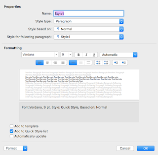
Before creating your Title font, go ahead and make your main body font. Name it something like Main Text, just remember what you use. I don't change the style type or even what the style is based on for the next two. Haven't need to use them ever. The style for the following paragraph? Use the name of the style you are making right now. That will tell it continue using it when you make a new paragraph. As for the other settings, under Formatting, choose the font and size, pick Justify Text from the first four box cluster. You can usually leave the rest alone.
 Do you see the drop-down menu in the bottom left that says Format? Drop that and pick Paragraph to get this next window. The first tab Index and Spacing in blue is where we'll start. If alignment doesn't say Justify, you can change that here too.
In Indentation, go to Special: choose First Line in the drop-down and pick .5". This will indent every paragraph for you.
In Spacing, again, just change Line Spacing's first dropdown to Multiple then type in 1.2. This is the industry standard. 
You're pretty much done with this, just click on the tab beside Indents and Spacing (Line and Page Breaks) for the next part.
This is pretty simple. I usually check Widow/Orphan control, keep lines together and don't hyphenate. You might not like how Keep Lines Together works, but don't skimp on Don't Hyphenate. You will end up with a mess of cut-off words that is a nightmare to read if you don't.
Once done, go ahead and click OK. You can always modify your new style later by highlighting it and clicking on Modify Style, which is beside the New Style button.


Now your Title Page font can be done in the same way, you might want to fiddle with size and font a bit before you find what you like. Once you have your Title Page the way you like it? Do this:

Next to Home is Insert. Go to the third option Page Break and hit that.


Dedication Page:
You can use your Main Text font or New Style/create another. I recommend naming it Author and using it both for the dedication and then again at the end to add a message to your readers. Personal preference there, but it unifies the usage of your personal message. For every separate page you want to add, MAKE SURE YOU INSERT> PAGE BREAK AFTER EACH ONE. This goes for every chapter, but I'll remind you again.

Before I take you through Table of Contents, go ahead and create your heading text. Name it something like Chapter Title.

Go through the process for your Main Text font, but pick these options:

 Properties> Style for Following Paragraph> Main Text (or whatever you named your main font)
Formatting> Center text (you may want to choose a slightly bigger font size and even put it in bold too)
 Indents and Spacing:
General- Just check to make sure Alignment says Center
You don't need indentation or spacing unless you want to. After typing your heading, tapping Return twice is sufficent, but you can set line spacing to double-spacing if you only ever fit headers into one line.
Eh, you probably won't need it, but go ahead and choose Widow/Orphan Control and Don't Hyphenate. This will manage the look of your headers if they're a little long winded.


If you also want a "Part 1, Part 2" whatever heading in your Table of Contents, make that style now. This will be assigned 1 in the hierarchy if you do, with your Chapters as a 2. I'm not going into that here, but I will explain the hierarchy deal with a screenshot since it will need to be set for your TOC regardless of whether you need more than one option or not.

Let's assume you only want Chapters to show up and you have that style now.

Table of Contents:

In the References tab, you'll find Table of Contents on the far left. When you click on that, it gives you this window. See Custom Table of Contents? That's the one you need.


 This is actually the part that people get hung up on, but I'll get you through it in one piece. You're going to leave most of the intro page alone and head straight down to the bottom left button, Modify...
 TOC1 stands in for your first font. Click on Modify here too. If you're doing a Part heading, make it look how you want that to look. You will then highlight TOC2 for the Chapter look.
If you are only doing Chapters, you will only need to modify TOC1 to look like it.
All this does is control what your headings look like in the table. Don't overthink this part. You can actually make this look completely different from the ones you use in the book itself.
Once you've clicked on OK for your Modify, click on Options in the main window instead. THIS is your hierarchy and for this, you need to find the actual style fonts you made and are using in your story and label them 1, 2, and so on. 
If you used Parts and Chapters, Part is 1 and Chapters is 2.
If you only use Chapters, find it and put 1 in the TOC level box. Click OK then OK again and we're done.
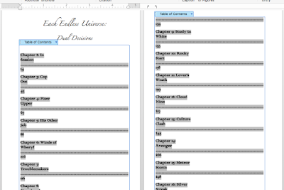


Now, by default, your chapters will fill in like this waste of space. Hate it. Luckily, there's a way to confine them into a single line and it's pretty simple. 
You probably notice that beside the ruler to the right are two facing arrows.
Do you also see the little white upward facing around at the beginning of the grey? Drag the bent arrow on the far right to the white one and it will disappear. Your TOC will then look like:

I had to highlight each chunk in separate sections and repeatedly drag the arrow, but it works and cleaned it up nicely.

Now, if you're doing this first, nothing will show up right away. If you're doing this last, your TOC will populate if you followed my instructions. You can choose to manually populate the TOC any time you add a new heading by updating the table.


Right click on the table and you will see Update Table in the list. Keep in mind that each time you update the entire table, you will have to do the arrow fix again. That won't happen if you're just updating the page numbers (something you might need to do if you change the font size of a style).

When you click on the page number of your chapter, it will warp you to that chapter so it may come in handy to keep updating.


It took me a LOT of trial and error to get this process to cooperate. Hopefully, it works for you right away. If you think you might have messed up or if I've left anything out, contact me so I can address it. If you help me catch something, I'll credit you in the updated blog post.

Margins:

Before you go too far, let's set this up.
 
 In the Layout tab, Margins is once more on the far left. At the very bottom once more is Custom Margins... Not the one with the star image but below that.

When you click on that, it takes you to:

Here.
For most books, a .5" all around keeps it simple, but if you write big novels exceeding 50K words, you might need a print allowance of .75 or .8 on the OUTSIDE option. Why outside not in? Because your first page needs to be on the right side, not the left. Your first page is on the right.

Notice also that you have to click mirror margin if your inside and outside are different. For ebook, .5" all around will work. I'll cover the final setting for print and ebook later though.

You'll notice Apply to: This Section. Generally, I go with Whole Document, but if you're doing the funky section breaks in your formatting, this might offset pages wrong. Just make sure you skim your sections.

Page Numbering:

This might be considered extra, but it's a pretty simple one. I'm going to assume you DIDN'T make this a pain in the ass by creating section breaks that will need to be altered for each section. You can go back and change numbering conventions for each section as needed. Maybe the Whole Document option will work, but always skim through and make sure this is working on your final manuscript.
In the Insert tab, you'll see Page Number off to the right of the strip this time.

 When you click on it, you get these options. Ignore that Add Page Numbers is a pop-up that is partially concealing the Page Number one that you need to click on.


 Clicking on Page Number takes you here. Set it to these (if you want centered numbers on the bottom). These are your options to choose from, but these are the setting I like. Once done, hit Format in the bottom left.


Again, this is yours to play with but the defaults are usually fine. Very self-explantory. I do want to point out for the section break users, that the Continue from Previous and Start at: options are  important. The Continue will pick up from the last number in the previous section. However, if you have a picture or don't want to count a page or two as the next in the sequence, you can use Start at: to make it continue from any number you like.


Content:

If you've done everything in order, you should be ready to go with your story. Start with your first Chapters entry, which should turn into Main Text when you hit Return/Enter. Another point of advice here is that if you have anything that needs to be italicized, create an Italic Main Text font. If for any reason you change the main font, this is a precaution against losing an italics. I don't trust Word's font + style additions deal, where you just click on a new setting without modifying the font. Whenever possible, unify all changes into their own font so you don't lose them on accident.

The only thing I want you to remember is that you should ALWAYS Page Break after a chapter, even if it creates a blank page. You will need those for the ebook format. Now you can take out blanks for the print, but it's a bit of a hassle, involving creating a section break and making sure the page numbering and mirroring stays fluid. My advice is to keep the blank pages unless you're really set on always starting the chapter on a right page or some other specific look. In my case, as long as the print flows, I'm not concerned about those choices. Again, I can help you if you want to, but this is a big area to cover and that's extra. 

Finishing:
Let's assume you're done writing and want to make sure your basic formatting is ready.

Did you:
Update your table of contents?
Insert all proper page breaks?
Use the right styles?

Once you've got the fine details done, I usually save the page set-up for the final step.

 For this, you'll need the top option bar of your computer. Go to File> Page Setup... in the pull down.
 It will take you here. Now in Paper Size, you won't have the Trade Paperback option. I made that for this purpose and you will too.
 The first options are what you will see, minus Trade Paperback yet. Go to Manage Custom Sizes... for now.
 You'll probably get untitled in purple, but you can double-click to rename it. But in 6 and 9 for your width and height and make everything else zeroes. You already set margins earlier. Keep in mind if you are doing 5x8, these settings still work without problems.


 OK back to this screen then take note of the Page Attributes drop down menu at the top.


Switch to Microsoft Word in that menu.

I think it always says apply to This Section in the default. Just make sure that gets switched to Whole Document then click OK.


At this point, you should be set to save for print.
 File> Save As... (and tell me you've been saving a LOT along the way) to get to the right menu.
 Make sure it's named something you can remember... In the file format drop-down menu...
You'll find Export Formats> PDF. That's what you need. It will change the blue Save button to Export. Just click on that to save.

You may get an error message about page numbers falling outside of a margin, but I'll never had this become an issue when publishing so you can ignore it. The Previewers on CreateSpace or KDP will catch this if it is a problem. If that is the case, go into Margins and just hike the bottom margin up .1 or .2" and that should solve it.


Your last check? Open your document in Adobe Acrobat and check for any blank pages or wrong facing pages. If you need to delete a page (sometimes formatting throws one in), there is a Tools option in AA's top bar that has a Delete Page option and you can then save the document in AA with the changes. How it looks on the AA pages is how it will look in print. If you followed my instructions, it should be sized right (the Page Setup is where that happened).

For Ebook:

Once you are sure your print PDF is in order, I would go ahead and do a Save As and name your regular docx file TITLENAME_Ebook so your ebook settings can be altered next.

Don't worry about changing your fonts because digital lets the reader choose these anyway. The only thing that needs to be done is to make sure all margins are .5". You will not need the Page Setup as you did for print. I hope you didn't use images because they are a pain unless you use fixed layout, which will also make your ebook useless for small digital screens. I opted not to learn this and just use ebooks for text only. You'll have to look elsewhere for that route and I will warn you, it's a pretty deep hole and there's a reason most people decide it's not worth it.

-----------

I may have missed a thing or two along the way, so if I did, let me know what I overlooked. I kept notes so I could try to be as thorough as possible but these things are also second nature to me now, so it's possible I overlooked something important. If something doesn't work for you, that's where I'll need to be more specific for others.

Phew, this was a long one, so I'm bowing out. I do hope this helps some of you self-starters beat the frustration of the process. Not everyone is as stubborn as I am.